The Three Foot Effect

Some white wines are using clear labels or direct printing on bottles to gain eye appeal and differentiation. Left to right: clear prime label with a reverse-printed backside label; direct printing on glass; and a blue bottle with clear label.
It starts three feet from the shelf. Your eye focuses on the label, taking in the images, the colors, the brand, even the texture of the substrate and whether special treatments—such as metallic inks or embossing—have been used. And when it’s done right, the engagement begins.
This initial connection is a critical moment. And while the brand and contents of the bottle are important, the design and visual impact of labels used on wines, spirits and craft-brewed beers can be critical to the purchase decision. As brands expand the flavors and styles available, brand owners, converters and substrate suppliers alike are rushing to create quintessentially ideal labels with on-the-shelf appeal to engage a customer in those ephemeral seconds of visual contact, while conveying the branding and ‘buy-me’ message that results in a sale. But what kind of labels do the best job?
Thin is clearly in
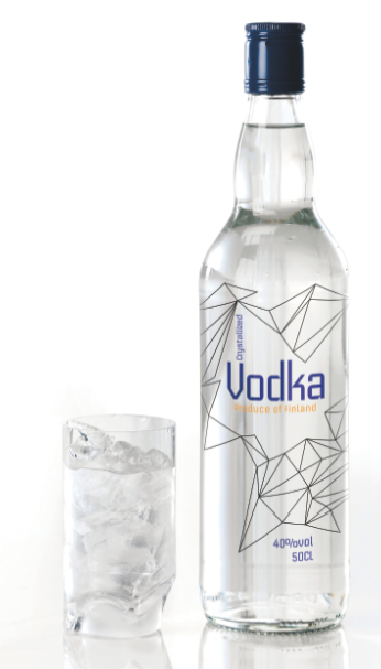
For spirits, that eye-to-shelf gap is where thin labels can stand out and even be mistaken for direct printing on the bottle, especially when the substrate is sufficiently thin that its edges (called a halo) are hard to see. “There’s a growing trend to use clear labels on spirits such as gin and vodka,” says Trevor Richardson, market development manager at UPM Raflatac Americas. This is accelerated by the growth of flavored versions of clear spirits, especially vodka, which has become the go-to choice for adding flavors that sometimes seem more at home in a gelato or ice cream shop.
“The store shelf is a real battlefield,” Richardson continues. “Brand owners are going after new consumers, especially Millennials, with an expanded range of flavors. At the same time, they are seeking to build brand loyalty and recognition.” And labels are the troops on the front lines.
In this environment, clear labels provide substantial flexibility. Mostly pressure-sensitive, they can be applied easily, offer a level of conformability for different container shapes, and can be more easily diecut to accommodate irregularly shaped designs than many paper-based labels. These traits are a main reason the no-label look is also showing up on bottled water, sauces, condiments, and many personal care products, especially those using rigid plastic containers.
Despite this, clear labels on wine bottles are less common, although some white wines now bear clear labels or direct printing, perhaps in an effort to gain eye appeal and provide differentiation from competing products with more traditional labels.
A key challenge, especially for beers and white wines, is the ability of a label to withstand cold and wet conditions. About the last thing the brand owner wants is for a label to come off a bottle that’s been doing time in a cooler or ice bucket. Selection of substrate, coating and adhesive is critical.
“Being able to survive an ice bath, maintain wet strength and not decompose or come off the bottle are key criteria,” says Hugh Lenz, business development manager for beer and beverage label and packaging materials at Avery Dennison. This is a relatively easy goal for many glue-applied paper labels, and the solutions are well known. Clear labels, often made of BOPP or PET films, would seem immune to such concerns, but there is one caveat: the adhesive must be impervious to whitening (typically at the edges of the label) when exposed to moisture. Not all adhesives are up to the job, so be sure to talk with your substrate provider to be sure the adhesive on the label stock is right for the application.
Bottles aren’t what they used to be
Converters printing labels for wine and spirits must also contend with the quality of the bottle. In the interest of cost control, many wine and spirits bottles are increasingly sourced from outside the US and Europe, and quality control can be less than ideal.
“Declining bottle quality is a fact of life, making it important to know where a bottle comes from,” affirms Frank Lamas, account executive at WS Packaging Group in San Luis Obispo, California, where wine labels account for a large share of the company’s business. “Many bottles have imperfections, such as not being truly round or having tiny pits in the surface that can pose problems when labels are applied.”
A paper label, either pressure-sensitive or glue-applied, can often cover up flaws in the bottle glass, and the new generation of very thin clear substrates can also accommodate less-than-ideal glass surfaces. Most of these challenges are already known to converters, who have developed their own workarounds and know which substrates will satisfy brand owners’ needs.
Large and tactile
For all the visual appeal of the no-label look for spirits, most wines still rely on paper labels. These range from simple square or rectangular designs for many generic wines to highly detailed and beautifully executed labels on pricier offerings. The latter range from three or four inches square with a variety of embossed and metallic effects to larger, high-impact art that snags the shopper across that critical three-foot gap, engages with some tactility, and may even add a story that incites interest and encourages the purchase decision.
Compelling original artwork enhances eye and shelf appeal of Rabble Wine Company's Force of Nature line.
“It’s always about shelf appeal, and many people will go after an eye-catching design,” says Lamas. “Some will even buy it just to show it off to their friends. Both the consumer and the wine maker influence this. The vintner is using a label to help convey a certain image, and when it works, the consumer is buying into that image.”
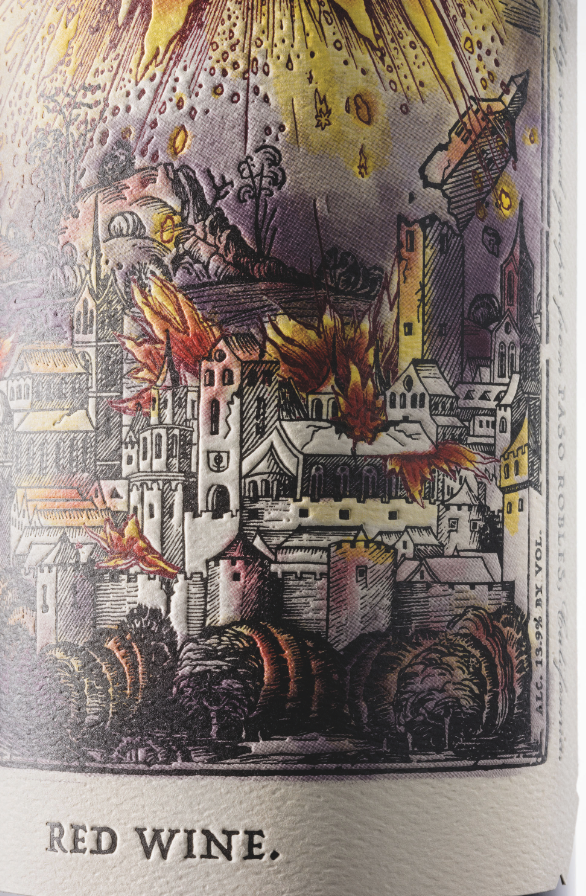
Rabble Wine Company, for example, uses large labels—5.25 inches by 5.75 inches—from WS Packaging, on some of its varietal wines. The labels use detailed artwork, are often extensively embossed, and make thoughtful use of color. The design, size of the label, and the bottle style create a bold, visual presentation that works in concert with the flavor of each wine to bring the product positioning to life. “The names alone—Force of Nature or Tooth & Nail—are imagery-driven,” explains Andrew Nelson, partner and vice president at Rabble Wine Company in Paso Robles and Santa Barbara, CA, maker of Rabble Wines. “We try to give a sense of exploration as they learn about the label.”
Creating just the right look and feel involves both the wine maker and the converter. “Early in the development process for the Force of Nature line, we looked at the possibility of running the labels flexo,” recounts Lamas. “But because the finished product wouldn’t have exactly matched the crispness of the original art that used designs reminiscent of woodcut prints, Rabble elected to use rotary offset for the entire line.”
Such attention to detail can set brands apart. Although Rabble’s labels are not especially difficult to print, Lamas notes that close attention is paid to the registration for the embossing because it is such an integral part of the desired look and feel. Color standards are dialed in from previous runs, and someone from Rabble goes to WS Packaging for every press check to make sure the color consistency and quality are all spot on. “They want to be involved in every aspect and make adjustments if necessary,” says Lamas. “I appreciate the care they take at every step of the process.”
With wines, though, the engagement must continue with the wine itself. “A label may get someone to try a wine, but if it’s not to their liking they won’t come back,” notes Nelson. “But if they like the wine, and the label helps make it more memorable, perhaps by encouraging some interaction, that can help drive repeat purchases as well as exploration of the other wines we offer.”
And it’s not only the retail shelf that’s important. According to Nelson, about half of Rabble’s sales are in small restaurants that do not have a sommelier to suggest wines to diners. “We find that the servers in these restaurants understand wine and food pairings, and are more likely to recommend a wine with a fun and engaging label when they know the wine will deliver for the customer.”
Interactivity in the wings

The label for each varietal is unique artwork. Some designs are reminiscent of woodcut printing, emphasized by heavy embossing. The effect adds visual and textural depth, creating a strong physical structure and bold shelf presence.
But suppose the wine-consumer connection could be made stronger. In our ever-more interactive age, the next step for wine and spirits labels is enhancing customer engagement with online interactivity. Distillers are already encouraging customers to send selfies and other photos of themselves to engage with the company on its websites, and more interactivity is not far behind. Wine makers, by comparison, are more conservative, yet as they seek to attract Millennials, they will almost certainly find new ways to reach out to wine drinkers.
For example, the technology already exists to have smartphone-readable images embedded into the art on a wine label. Scanning that image with a smartphone app could take the user to a website where they could learn more about the wine—and place an order for a bottle or a case. Now imagine the power of that connection when it takes place in a restaurant where the wine has been selected based on the recommendations of knowledgeable waitstaff or the sommelier. Innovative wine makers are already thinking this way and orders for the needed labels could be coming soon to savvy label printers and converters.
Whether the label is on a bottle of wine or spirits, its first objective is to engage with the consumer, evoke emotion and spur the purchase decision. And it all starts at that three-foot, eye-to-shelf gap.


